Askeuomorphic UI — visual design for digital natives.

Introduction
The aim of this article is to explore how elements of UI (user interface) design evolved from the analogue world of physical, three dimensional switches, dials and buttons. It also examines potential current and future roles for skeuomorphs (digital components which look like real-world objects) within the field of software and product design.
This short analysis will conclude that an askeuomorphic approach to UI design, through which real-world-like components are abandoned, is a naturally appropriate direction to follow within a population of digitally native and assimilated users. However, skeuomorphism does continue to provide an interesting option within the field of gamification design.
Evolving UI — rich to flat
To lay down some context, it’s worth taking a quick look at how the look and feel of screen based design has evolved over the last couple of decades, from rich to flat.
Flat design is all about minimalism; minimal colour, minimal detail and minimal quantity of elements. This sharply contrasts with the so-called Rich Design approach of the early 2000’s, where 3D elements, gradients and realism were stable features of graphical interface design.
This transition is clearly visible when we take a look at the timeline of the Google Chrome logo during that period.

source: wikipediae Chrome Logo
source: wikipedia
The Google Chrome logo reveals how, over time, its design morphed from a 3D, detailed format, complete with realistic lighting effects into the flat minimalist version we see today.
This change in style isn’t merely a response to a trend or a shift in popular taste; there is a pragmatic explanation. The evolution of graphical interface design from rich to flat runs parallel to a blossoming population of native digital users for whom UI makes sense without the necessity of visual cues to three-dimensional objects in the physical world.
Technological Paradigms
When we think about old-fashioned telephones, we imagine dials, knobs, wires, aerials and buttons. Telephones have been used since the 19th century. Yet, it is hard to imagine a person, even as recently as 1990, being able to operate a modern smartphone. Notions of swiping, tapping, apps, wi-fi, and SIM cards would all seem bewilderingly alien to them. The same thing, but in reverse, is seen when millennials are challenged to operate a rotary dial phone in TV shows and YouTube experiments. They struggle to understand how the dial works and fail to compose a number. The experiment illustrates how uninitiated users cannot easily adapt to interfaces from different technological paradigms.
This is why, when personal computers began to include a visual graphical interface (as opposed to a text based command line), three-dimensional attributes from the physical world were brought across to the virtual world of pixels. They were designed to provide the user with visual cues about the purpose and application of a UI element. For example, buttons in early versions of Microsoft Windows include drop shadow and lighting effects to mimic the physical properties of a real-worldhardware button. These visual cues help make the element’s action perceivable to the user. This perceptibility quality, of an element’s design, is known as the element’s affordance, a term coined by perceptual psychologist J. J. Gibson (1977, 1979) and later adapted to the field of human-computer interaction by Donald Norman (University of California) [Norman, 2004].
e.g. a three-dimensional looking digital button affords to be pressed due to it’s raised appearance.
An affordance represented by a relatable real-world object on a computer screen is called a skeuomorph, from the Greek skeuos (implement) and morphe (form). The Recycle Bin in the above Windows 95 image is an enduring example of a skeuomorph.
oxfordlearnersdictionaries.com
Digitally Assimilated Populations
Today, populations consist primarily of digital natives (those born after 1980, a.k.a Generation Y/Z alongside digital interfaces) and their predecessors, digital immigrants (those born before 1980), who have also become, for the most part, digitally assimilated. The notion of labelling cross-sections of people in terms of digital familiarity was popularised by the American education writer, Marc Prensky in an article “On the Horizon” in 2001. (Prensky, 2001)
So, given that most people are now either digitally native or adept, we no longer require visual cueing through representations of objects from the real-world. In which case, three-dimensional properties of UI elements — light, shade, form and texture provide no further functional utility. This has led to the adoption of flat, minimalistinterface designs, which is clearly visible when comparing the buttons from Windows 95(fig 2)and Windows 10 (fig 3).

The UI of today’s popular operating systems and apps is askeuomorphic by design as users have become adept to the language of modern visual interface design.
Semiotic Adaptation
The philosopher of language, Catherine Legg (Deakin University) says that “we do not work out what signs mean in some abstract overall sense and then work out to what use they are being put; rather, we must understand to what use signs are being put in order to work out what they mean.” [9]
Many digital natives will likely struggle to explain what the shape of the common save icon represents. Everyone understands that it saves a file, but, do not necessarily know that the icon is semantically representative of a floppy disk; or, even what is a floppy disk nor how it is used in the real-world. It is a curious example of skeuomorphic adaptation. As anyone can see from the highly popular Font Awesome icon library, the save icon is still represented (here in 2020) by a floppy disk.
While the floppy disk has long since vanished from the physical world of popular culture, it’s icon lives on. The notion (a saving device) and its fairly distinct two-dimensional format has helped the floppy survive into the era of askeuomorphic design. The icon is neither romantic (although the notion of the original object might be) nor cosmetically appealing, it is neither semantically consistent (floppy disks are long-since obsolete) nor pragmatic (it has to be learned by younger users; e.g. it is not intuitive in the way that an add (+) icon is) . So, its semantic survival and subsequent adaptation into askeuomorphic design is purely by convention. It has become a sign that happens to mean save, rather than a functioning visual cue or aesthetic preference.
Within the visual language of askeuomorphic interface design, philosophical pragmatism enables both intuitive signposting, elements we learn from an early age (arrows as direction pointers, elementary maths symbols to indicate adding and removing); but, also novelty variants like the floppy disk icon. As an abstract language, user interface design involves an element of learning [by its users] from experience, but also abidance to convention. What remains the most important consideration for pure communication is the success of its [an element of the language] instructional quality. The save icon instructs it’s purpose by convention rather than via intuition.
Gamified Skeuomorphs
If signs are adopted by convention or learnt through experience of the real-world in which we live, and three-dimensional visual cues that are derived from physical knobs, switches and buttons have become functionally redundant on our screens, in what form and for what purpose might skeuomorphism persist in modern interface design?
The answer is perhaps for fun. Yes, knobs, switches, dials and buttons could survive purely to provide an app’s user with a ludic layer of interactivity. On this basis, the realistic rendering of real-world objects becomes an implementation of gamification.
A modern askeuomorphically designed app can be enhanced by elements of three-dimensional realist design in the form of a secondary gamified UI layer. This layer is implemented for fun rather than utility.
A good example of this is AmpliTube, an app for setting up virtual sound amps for musicians. The AmpliTube app’s primary navigation and layout is flat whereas the main console from which users control their sound settings is represented by realistic knobs from classic amplifiers in the real-world.
The app’s user can appreciate the nostalgic look and feel while having fun twiddling the knobs. Even if it’s harder to accurately set them to a precise position, it’s fun to pretend that these are real knobs and this is a real amp.

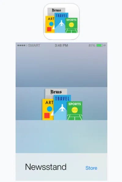
However, this hybrid approach can also lead to complications. In 2011, Apple released its Newstand app for iOS. The app’s home-screen and main icon were overwhelmingly skeuomorphic in design.
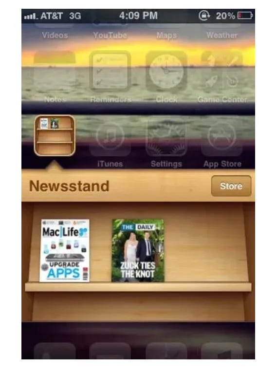
image source: maketecheasier.com
In iOS Newstand the app bar included a store button and the title of the app, while the main interface consisted of a realist rendering of a real-world news-rack, complete with virtual copies of magazines which updated as and when new editions became available. However, the design was problematic. New York UX designer Josh Clark’s blog article discusses one issue with how the app icon was designed to reflect the app home screen and remain in sync together. But, while magazines usually updated on a monthly basis, daily publications like newspapers were harder to keep up with. So, the icon and home-screen fell out of sync. The skeuomorphic design was later replaced with a flatter design with a static home-screen layout. The app was eventually removed with the release of iOS9.
(image source: wikipedia)
It’s worth noting that skeuomorphism is not limited to software design. David Oswald from Berlin University of Applied Science, notes that classic products like cars still maintain physical interfaces into the age of digitalisation. Using the car example, at a technical level the physical steering wheel, accelerator and brake pedals have become mere digital input devices (Oswald, 2014, p6).
Furthermore, skeuomorphic gamification might also be applied to this context. For those motor car enthusiasts who lament the absence of vroom in modern electric cars, perhaps designers could apply sound effects that correspond to the pressing of the accelerator pedal; to make the experience of driving feel more authentic and fun.
So, in software and classic product design, gamification can provide the platform for the continuation of skeuomorphs into the age of native digitalisation.
Askeuomorphism & Beauty
Askeuomorphism is a design approach that favours philosophical pragmatism and utility over realism or user sentiment. But, that is not to say that askeuomorphic design is ugly. The approach involves stripping away detailed realism — texture, light, volume as well as breaking away from the pedagogical or nostalgic associations with legacy interface components from the analogue era. Yet, true to the Gestalt principle [8]of the “Unified Whole”, this approach to interface design of stripping back and focussing on the eye as well as the mind, produces a minimalist, uncluttered and cohesive aesthetic.
“The whole is other than the sum of the parts”
Kurt Koffka, German psychologist (1886–1941)
Flat Style Illustration
The practical success of askeuomorphist user interface design has led to a fortuitous birth of a flat, minimalist aesthetic in other areas of design, too. Working with limited palettes and simple forms, digital illustrators are producing fresh and vibrant images and animations that can be seen across the web and device apps; ranging from Google to National Government apps and websites. The flat-style artwork combines elegantly with askeuomorphic user interface design.

source: domains.google.com
Conclusion
Skeuomorphic components in current and future app design can be used to provide a layer of gamification. Three dimensional knobs, switches, dials and buttons can be fun to interact with. However, it is important to differentiate between the primary interface which will determine a user’s navigational experience, and the parts of the app which are intended to be playful.
References & Resources
- https://www.oxfordlearnersdictionaries.com/definition/english/skeuomorph?q=skeuomorph
- https://fontawesome.com/icons/save
- https://www.ibm.com/ibm/history/ibm100/us/en/icons/floppy/
- https://plato.stanford.edu/entries/peirce-semiotics/
- https://www.macworld.com/article/2984560/how-to-get-started-with-apple-news-ios-9s-newsstand-replacement.html
- https://www.maketecheasier.com/complete-guide-to-newsstands-for-ios/
- https://bigmedium.com/ideas/newsstand-revisited.html
- https://www.interaction-design.org/literature/topics/gestalt-principles
- Legg, C. (2015). The Purpose of the Essential Indexical (Commens Working Papers no. 6). Retrieved from Commens: Digital Companion to C. S. Peirce, http://www.commens.org/papers/paper/legg-catherine-2015-purpose-essential-indexical.
- Legg, C., 2008. “The Problem of the Essential Icon”. American Philosophical Quarterly. 45(3), 207–232.
- Norman, Donald. (2004). Affordances and Design.
- Oswald, David. (2014). Flat Design vs. Skeuomorphism — Effects on Learnability and Image Attribution in Digital Product Interfaces..
- Prensky, Marc. (2001). Digital Natives, Digital Immigrants Part 1. On the Horizon. 9. 1–6. 10.1108/10748120110424816.
Originally published at https://blog.matwright.dev on May 22, 2020.